Color Depth
Let me save you several man-years of effort with three simple suggestions.
1. Avoid ANSI 16 & ANSI 256 0-15 (usually)
All modern terminals let the user customize the "theme", which means customizing ANSI colors 0-15 along with the fg and bg for the terminal. We are stuck with a primitive system for communicating color between apps and the host terminal. App requests color 4 and the terminal shows whatever the user picked for blue.
For example, I use Catppuccin Frappe, which is set up like so:
# catppuccin-frappe.conf ghostty theme
palette = 0=#51576d
palette = 1=#e78284
palette = 2=#a6d189
palette = 3=#e5c890
palette = 4=#8caaee
palette = 5=#f4b8e4
palette = 6=#81c8be
palette = 7=#a5adce
palette = 8=#626880
palette = 9=#e78284
palette = 10=#a6d189
palette = 11=#e5c890
palette = 12=#8caaee
palette = 13=#f4b8e4
palette = 14=#81c8be
palette = 15=#b5bfe2

foreground = #c6d0f5
background = #303446
...
Normal Colors (Catppuccin Frappe)
| name | rgb | ansi16 fg | ansi16 bg | ansi256 fg | ansi256 bg |
|---|---|---|---|---|---|
| black | #51576d | \e[30m | \e[40m | \e[38;5;0m | \e[48;5;0m |
| red | #e78284 | \e[31m | \e[41m | \e[38;5;1m | \e[48;5;1m |
| green | #a6d189 | \e[32m | \e[42m | \e[38;5;2m | \e[48;5;2m |
| yellow | #e5c890 | \e[33m | \e[43m | \e[38;5;3m | \e[48;5;3m |
| blue | #8caaee | \e[34m | \e[44m | \e[38;5;4m | \e[48;5;4m |
| magenta | #f4b8e4 | \e[35m | \e[45m | \e[38;5;5m | \e[48;5;5m |
| cyan | #81c8be | \e[36m | \e[46m | \e[38;5;6m | \e[48;5;6m |
| white | #a5adce | \e[37m | \e[47m | \e[38;5;7m | \e[48;5;7m |
| foreground | #c6d0f5 | \e[39m | |||
| background | #303446 | \e[49m |
and the anachronistically named bright variants are part of the theme too:
"Bright" Colors (Catppuccin Frappe)
| name | rgb | ansi16 fg | ansi16 bg | ansi256 fg | ansi256 bg |
|---|---|---|---|---|---|
| black | #626880 | \e[90m | \e[100m | \e[38;5;8m | \e[48;5;8m |
| red | #e78284 | \e[91m | \e[101m | \e[38;5;9m | \e[48;5;9m |
| green | #a6d189 | \e[92m | \e[102m | \e[38;5;10m | \e[48;5;10m |
| yellow | #e5c890 | \e[93m | \e[103m | \e[38;5;11m | \e[48;5;11m |
| blue | #8caaee | \e[94m | \e[104m | \e[38;5;12m | \e[48;5;12m |
| magenta | #f4b8e4 | \e[95m | \e[105m | \e[38;5;13m | \e[48;5;13m |
| cyan | #81c8be | \e[96m | \e[106m | \e[38;5;14m | \e[48;5;14m |
| white | #b5bfe2 | \e[97m | \e[107m | \e[38;5;15m | \e[48;5;15m |
Helpful Illustration
There are many, many apps that suffer from this problem because they try to use ansi 16 and make assumptions about the user's terminal theme. When we create UI with the user's colors, things can easily go astray. Just because the internet calls that ansi 16 color "white" doesn't mean it's going to look much like white.
The ANSI 16 Paradox tool shows this failure across every theme bundled with Ghostty.
# ansi16 white on ansi16 green (borked)
printf '\e[37;42m 1. hello, world \e[0m\n'

# ansi256 brightwhite on ansi256 green (borked)
printf '\e[38;5;15;48;5;2m 2. hello, world \e[0m\n'

# ansi 256 system white on ansi256 system green (AWESOMENESS)
printf '\e[38;5;255;48;5;40m 3. hello, world \e[0m\n'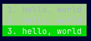
2. ANSI 256 (but only colors 16-255)
ANSI 256 is totally sufficient for most apps. Avoid colors 0-15, they lie. When I say WHITE, I mean WHITE. Not off white. WHITE.
Feel free to go all the way to ANSI 16M, of course. As your app grows in popularity you may encounter oddball terminals that don't support it, so consider using a library that downsamples on your behalf.
The ANSI 256 color cube is pretty neat. xterm added support way back in 1999. Thanks Todd! I have an entire page about the ANSI 256 color cube that you should read. BTW here is rb code to generate the cube:
# Calculate ANSI 256 color cube
# adapted from https://gist.github.com/hSATAC/1095100

CUBE = [0x00, 0x5f, 0x87, 0xaf, 0xd7, 0xff]

def hex256(index)
  if index < 232
    off = index - 16
    r = CUBE[(off / 36) % 6]
    g = CUBE[(off /  6) % 6]
    b = CUBE[(off /  1) % 6]
  else
    r = g = b = 8 + (index - 232) * 10
  end
  format("#%02x%02x%02x", r, g, b)
end

ansi256 = (0..255).map { hex256(_1) if _1 >= 16 }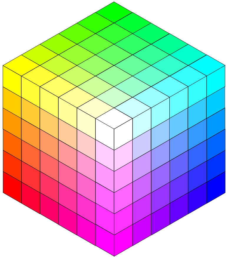
3. Be Thoughtful about Background
Leave the background color alone most of the time. This is the #1 thing you can do to make your app play nicely with the terminal theme. On the other hand, I love drawing attention to headers or important information by inverting colors. On a dark terminal that means true white foreground on a pretty, saturated background color. Vice versa for light terminals.
Special note on downsampling. It's easy to write a function that takes an RGB color and finds the closest ANSI 256 16-255 color using euclidean distance. Be careful - that approach completely fails to take actual human vision into account. You might want to read this, or at least ask your llm to consider the problem.
The Giant Contrast Table can help you pick high contrast color combinations for the terminal.